
They say hindsight is 2020, and as 2020 is quickly approaching hindsight, it’s time to think about what the future holds for your company and your brand. Some would say this has been a dark year for the world of business and want to start off on the right foot for a brighter tomorrow, and they’ve done this with a fresh-faced logo.
Many companies have taken the rebrand plunge this year and created or commissioned a new logo. From Popeyes to Google, we’ve seen a massive trend towards brighter, bolder, and more lower-case logos. And while there are overarching trends, not everyone can agree on what the best practices for new logos are.
Colours
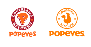
One of the best ways to distinguish your brand is with a special colour. Tiffany blue is instantly recognisable, Gucci can be expressed with a certain combination of red and green, Jay-Z owns a shade of blue (but that’s not the most useful). Recently, we’ve seen brands go one of three directions when it comes to the use of colour in logos. First, some brands are reducing the amount of colour in their logo or removing it altogether. This year, TripAdvisor removed all the colour from their logo, leaving just the outline of their owl and wordmark and occasionally reincorporating their iconic green. Popeyes removed their extra shades of red to just a single orange logo.

Alternatively, tech companies have been shifting toward primary colours. Google changed all their icons to incorporate all four primary colours. Microsoft, eBay, Slack, Monday, and other tech sites followed the trend. Traditionally, fast food regularly incorporates red and yellow, while social media heavily uses blue. There’s a whole psychology behind brand colours that we can go into later, but what we’re seeing this year is that fewer colours are being used.
Verdict: the world is moving toward fewer colours, and we’re right there with the trend. But it’s not just about using fewer colours, it’s about using colours intentionally. Every colour you use in your logo needs to not only mean something but needs to carry forward into the rest of your brand.
Gradients
Gradients, or the gradual fade from one colour to another, have been on their way out for almost a decade. When the iPhone first came out in 2006, it changed the design world forever. Every icon and menu and button was full-to-the-brim with drop shadows, bevels, glare, and of course gradients. These graphic overlays tried to convey a sense of depth and tactile touch, recreating physical buttons on a cold, flat screen. But when iOS 7 booted up in the fall of 2013, the design philosophy known as skeuomorphism (making everything look real) was thrown out the window in favour of simple, subtle gradients. And today, that’s what you’ll see on your iPhone. You’ll notice that the iMessages on the top of the screen are a slightly lighter blue than the messages at the bottom of the screen. On the other hand, Instagram changed its logo two years ago, from a skeuomorphic, stylized camera to a simple outline on a gradient, and received a hefty amount of backlash.
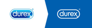
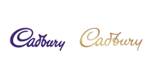
This year, we see the gradient going in two directions: yes gradients and no gradients. Durex, in addition to rounding off the silhouette of their logo, removed the blue/light blue gradient in favour of a single deep blue. Meanwhile, Cadbury leaned into their namesake and replaced their iconic purple with a gradient that looks like gold foil.
Verdict: are gradients in or out? We say: out. Unless you’re going for an old-school logo, keep to solid colours. Not only are gradients on their way out, stylistically, but they can make it more difficult to keep your logo consistent across digital and physical media, plus it’s harder to pin down your colours if they’re constantly shifting.
Car Logos
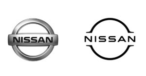
Another use of gradients that fell out of style this year was specifically for the automotive industry. Toyota, Nissan, and BMW have changed their logos into flat, digital designs, instead of their traditional car-emblem-style logos. These changes were largely made to indicate a streamlined future, featuring electric cars, with Nissan and BMW are rolling out their logos alongside new electric vehicles. Due to the dimensionality of emblem-style logos, this has mixed results, depending on the complexity of each logo. Audi has already changed its logo, simply replacing the “metal” parts with black, which Toyota followed. BMW (and other companies like Alfa Romero) have the option of retaining colours in their future-syle logos.
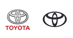
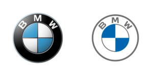
Verdict: we’re holding our breath on this one. BMW recently released a concept with the transparent logo on the car. Sure, it looks futuristic, but the clear plastic makes it look significantly less substantial than your traditional emblem.
Brand Unity
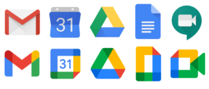
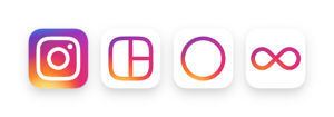
When you have multiple brands, you, of course, want to make sure you can stay consistent while still being visually diverse. Unity has always been an important tenant of branding, and this year is no exception. You want your logos to evoke the same feeling without being precisely the same. An easy way to do this is to reuse colour schemes and general design motifs. Two examples we can look at come from Google and Instagram. Both have a set of app icons that feature the same colour scheme, and the same abstract outlines. But both brands have performed wildly differently. While Instagram kept their shapes diverse, Google opted to reduce all their icons to the same, rectangular shape, making them indistinguishable at first glance.
Verdict: especially with brand unity, diversity is incredibly important. We suggest keeping one element completely free when creating a family of logos. If you’re keeping the style and colours consistent, change up the shape, like Instagram. If you’re keeping the shape and style consistent, change up the colours (within your palette of course).
Symbolism
The biggest flaw in Google’s redesign is that it removes any symbolic value that the icons may have had. Instead of an envelope, the Gmail logo is now a multicoloured letter M. Instead of a page with (indications of) words, Google Docs is just a rectangle, whose outlines take away from the indication of a page with a folded corner (the symbol used across platforms to represent word documents). Instead of a camera for Google Meet, we have an image strikingly similar to Google Docs and Google Calendar.
Instagram on the other hand, retained enough detail in its Instagram and layout icons to indicate a camera and, well, a layout. But they were also able to create distinctive icons for Boomerang and Hyperlapse, which don’t have real-world equivalents (except boomerangs, but it’s different).
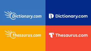
My favourite example of symbolism in a 2020 rebrand comes from Dictionary.com. Both Dictionary.com and Thesaurus.com used to feature a starburst coming from their name, while this was distinctive, it wasn’t unique to Dictionary.com nor representative of what services they offer. Now, both logos merge the first letter of each service with the silhouette of an open book (an open dictionary and thesaurus respectively).
Verdict: a picture is worth a thousand words. If you can pack symbolism or hint at a greater message in your single icon, that can do wonders for your brand. Not everyone has the luxury of a symbol like Nike, where the shape is meaningless without the attached brand. So for startups, we suggest symbolism that relates to your name or to the service that you offer.
Simplification
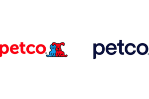
All of these different changes are just examples of one overall trend: simplification. Whether it’s removing extra colours from a logo (or removing all colours, like Go Daddy and Trip Advisor), removing imagery like PetCo, or replacing stylised lettering with a single font like Thrillist, the overall trend for 2020 (and perhaps into 2021) is simplification.
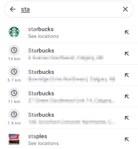
But simplification isn’t just a stylistic trend, it’s also a practical one. The way we interact with the brands around us is getting smaller and smaller. Recently, Google Maps has added an option to search for specific franchises, featuring a tiny, barely visible logo. We can see an example of Starbucks, whose logo is recognisable here, even if most of the details are lost. Staples, on the other hand, doesn’t have a logo optimised for this new use case. Their new “staple” logo may fit in the frame, but wouldn’t be recognisable without the wordmark next to it. Logos or wordmarks need to be discernable when they’re very small and very far away, the best way to do this is to remove as much detail as possible (see the Starbucks example) and use bold shapes and colours to convey your brand.
So when you’re designing a new logo for your company in 2021, remember to keep it simple, keep it bold, and keep it bright. Look at your designs from 20 feet away and see if they still make sense. Look at your images in isolation and see if they still tell your brand’s story. If you have multiple brands, line them up and see what doesn’t fit, then see how long it takes to find what you’re looking for. You customers will be looking for your brand in a sea of logos so help them find it quickly and easily in the coming year.